Over summer 2020, I interned at Neolth.com, a stress management tool for students. As part of the Design team, I worked on developing the Ideas and designs, creating design system and developer hand off for two projects;
1. Improve the "Assessment".
2. Improve students'experience with platform (Unfortunately due to NDA, I can't share much details about this project).
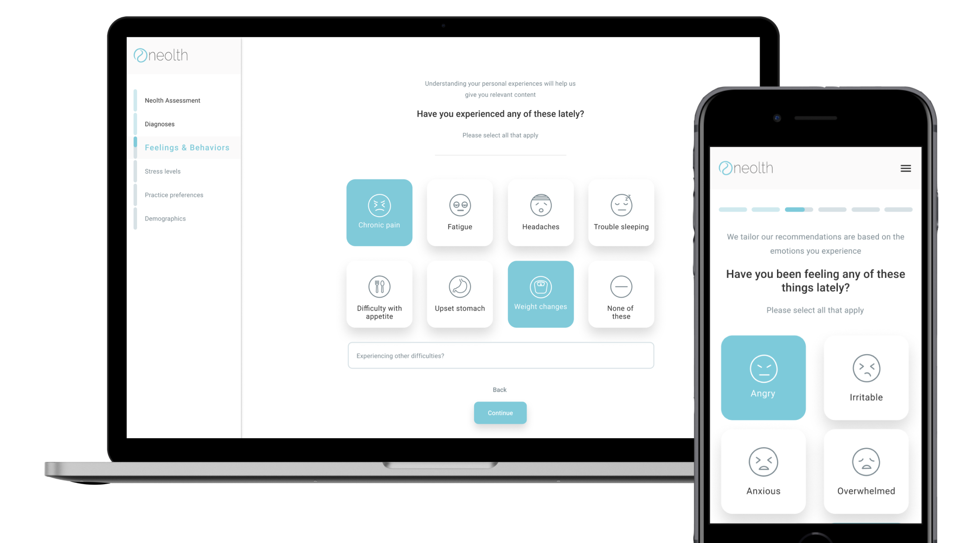
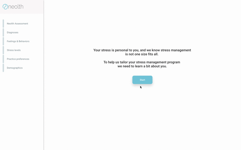
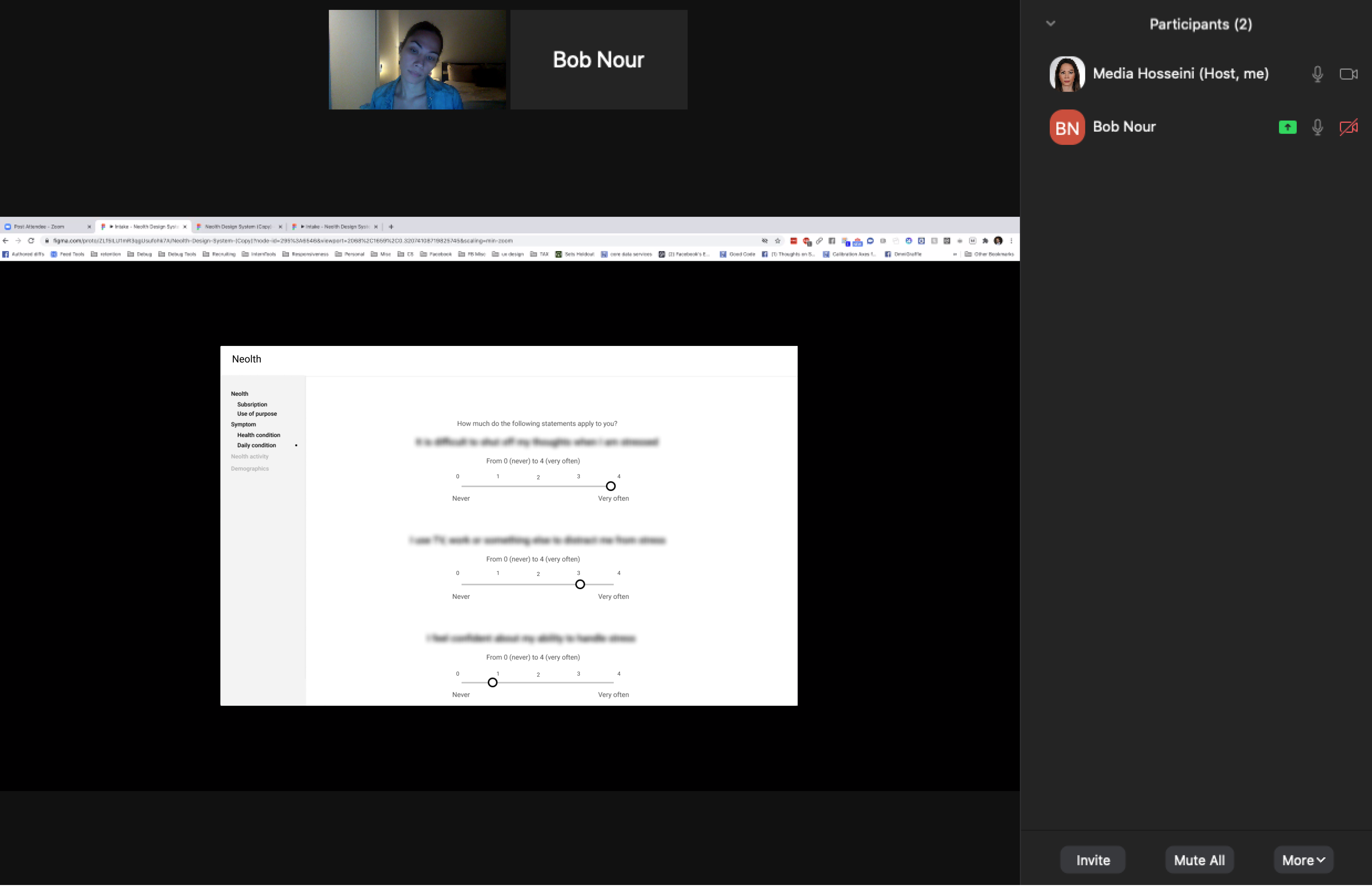
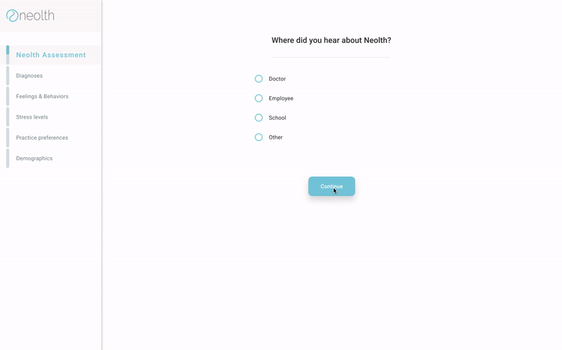
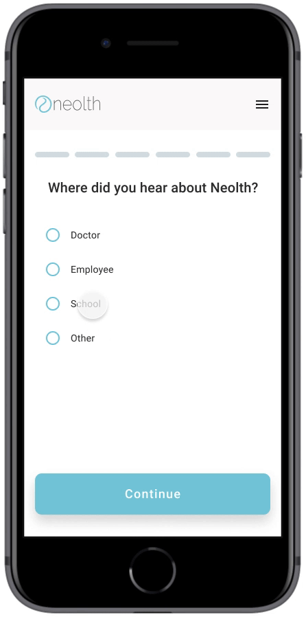
Stress has increased with the uncertainty of the COVID-19 campus closures. With Neolth, students get matched to the right behavioral care and can get instant help managing their stress. My tasks was to improve the usability of “Assessment” to help users have better access to Neolth’s support. The "Assessment" is a source asset to gather and address the student’s immediate needs.
Product designer
Brand identity designer
Figma
Miro
Gitlab
Sheena Patel (Product Management Intern)
Joe Henrichs (Design Intern)
Botao lu (Design Researcher)
Mansi Modi (Developer)
4 Weeks
In order to discover the improvement areas, I did the heuristic evaluation, then with the other designer, we ran some usability testing sessions with current users. In the end, we identified the major areas that need to be improved on the assessment experience:
Neolth "Assessment" old version
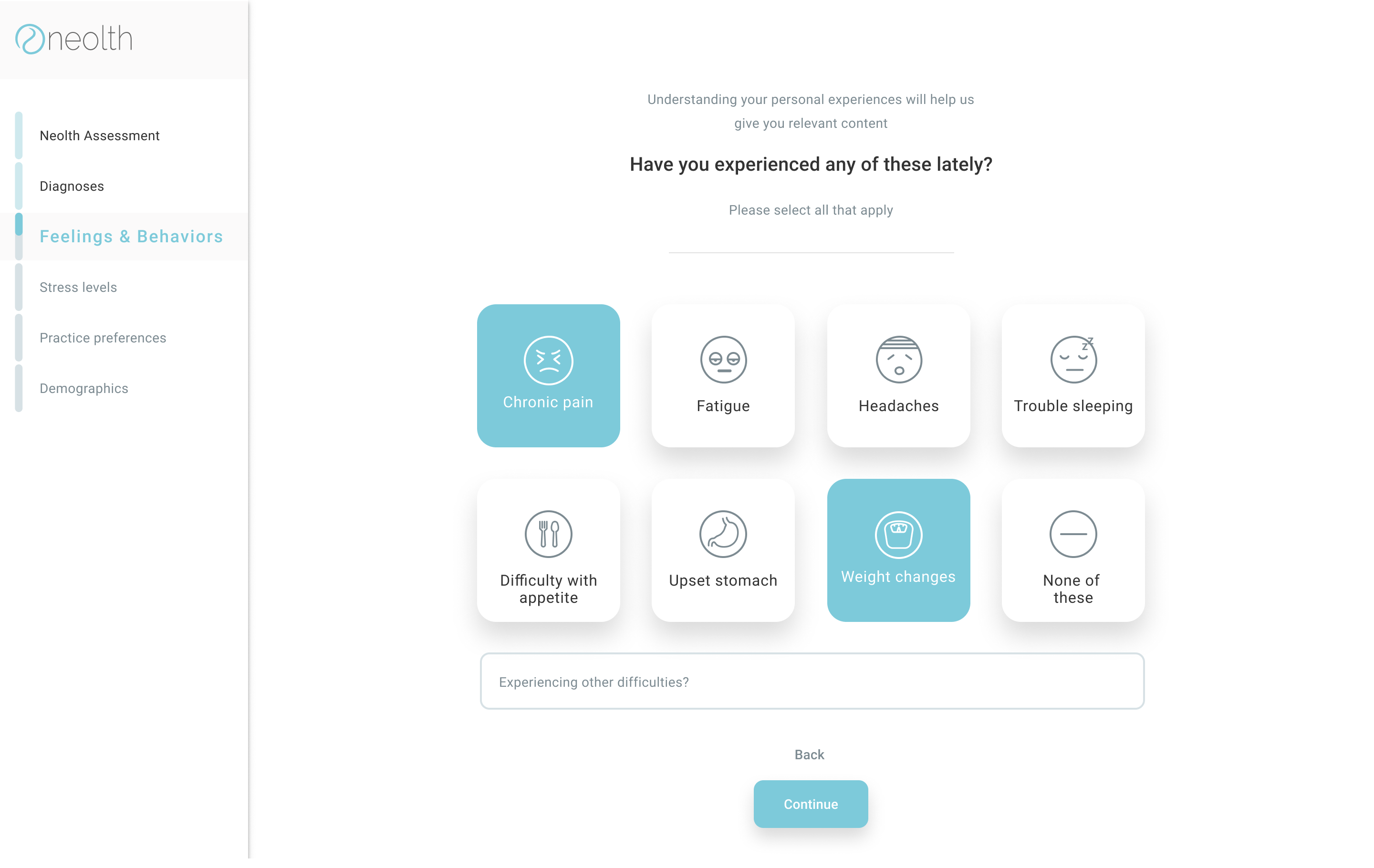
Sneak peek to the design
First, I gathered different examples of how other services are doing when it comes to the assessment process but I couldn't find too many examples with similar services (mental health) whose assessment process has aligned with user needs, so I found and analyzed other services with better strategies.


Helps students to find the right college or graduate program.

A platform connecting real audiences with the market research community through rewarded surveys.
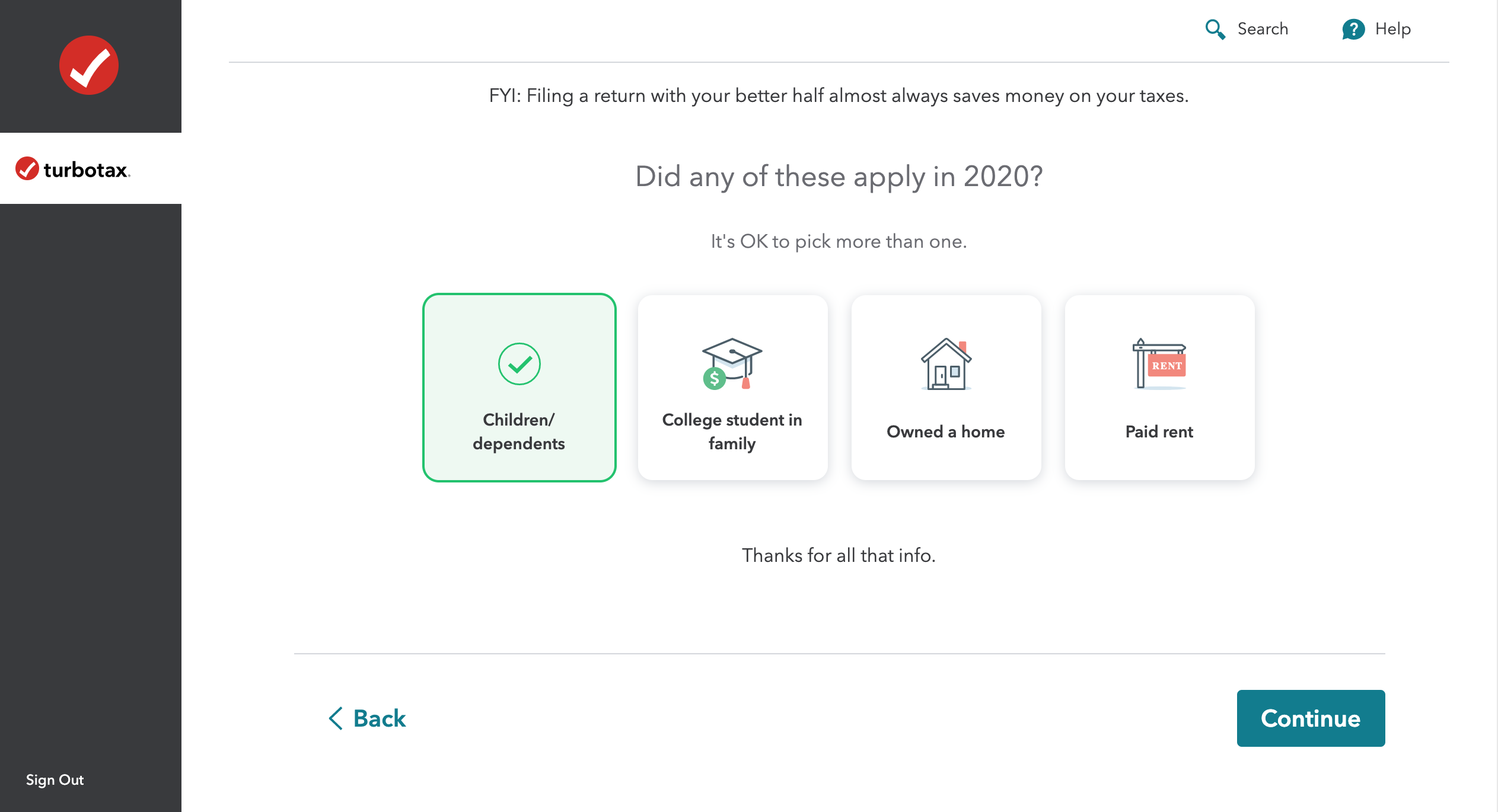

Tax preparation software to file taxes online.
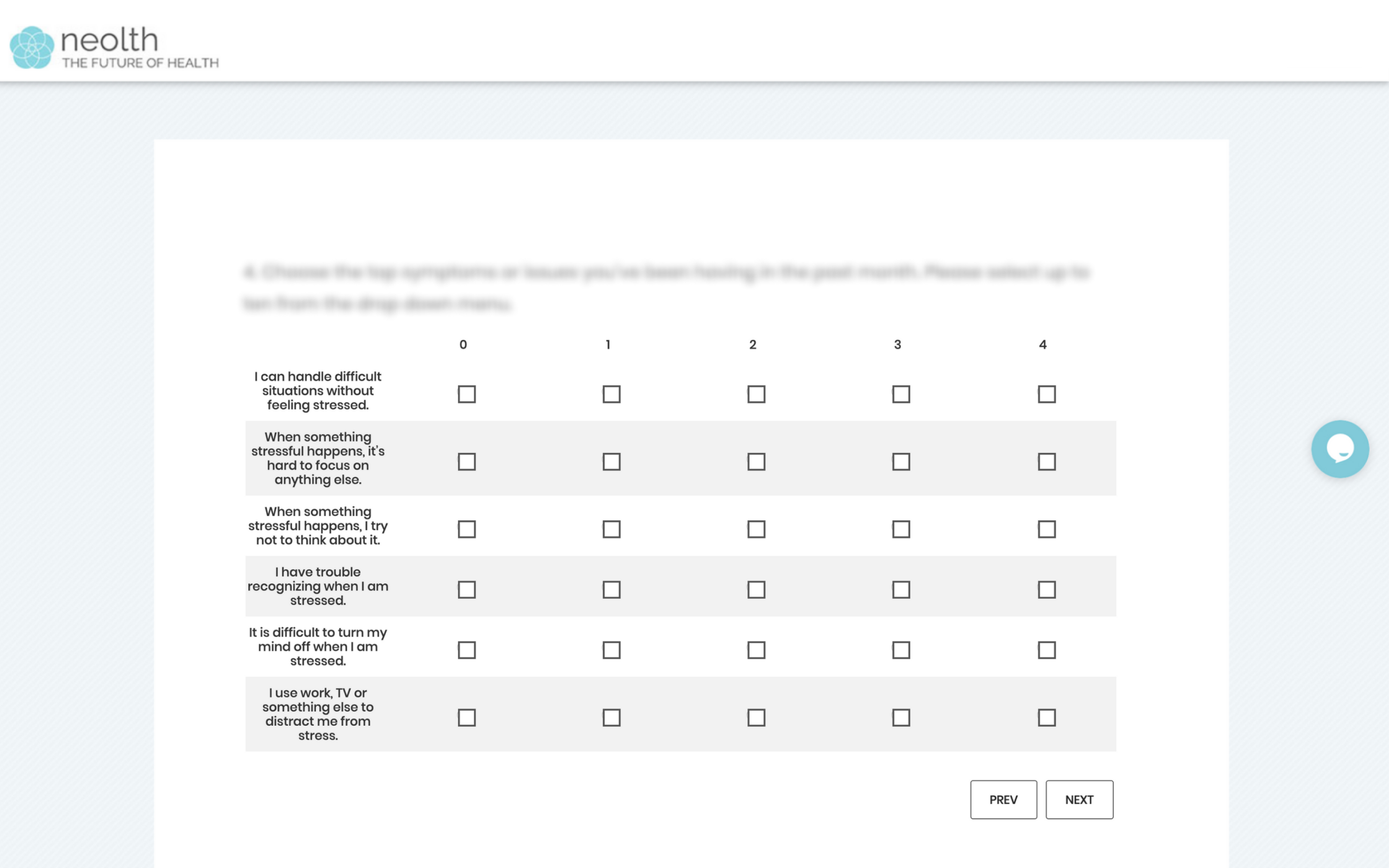
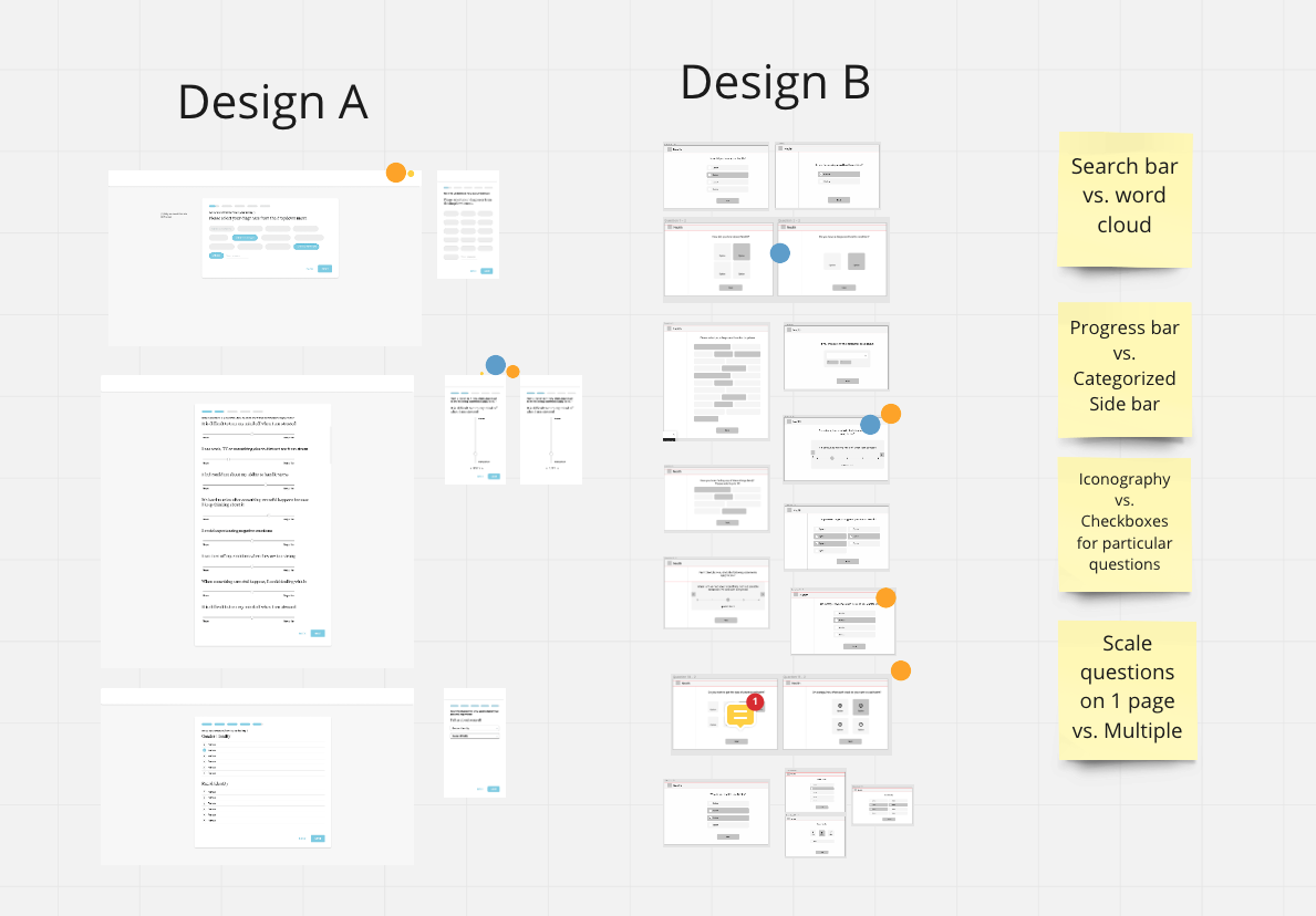
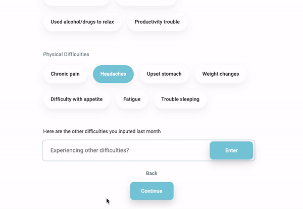
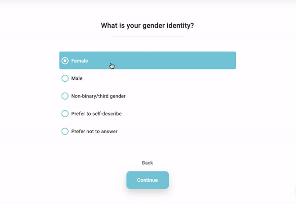
In order to visualize all ideas into rough designs, I and the other designer of the team built wireframes for the main and challenging sections of the assessment. For wireframes A I identified the advantages and disadvantages of proposed ideas and tried to improve them on wireframes B, before using them for usability testing. Below I explained changes that are considered for each component of pages.
Miro Brainstorming Board
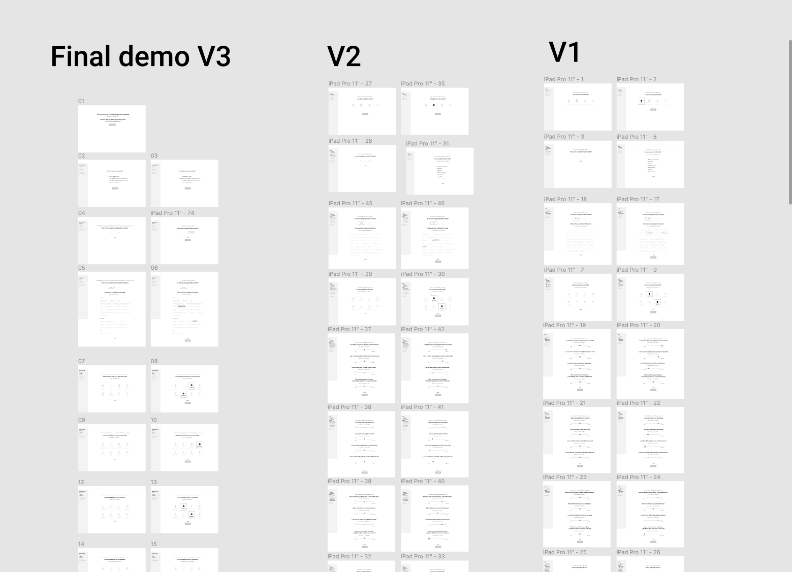
After a few rounds of back and forth with the team we landed on version 3 as our final flow to be put through user testing.
Iteration Board
In this phase, I conducted usability testing find out errors based on the users’ feedback.
Process for moderated testing;
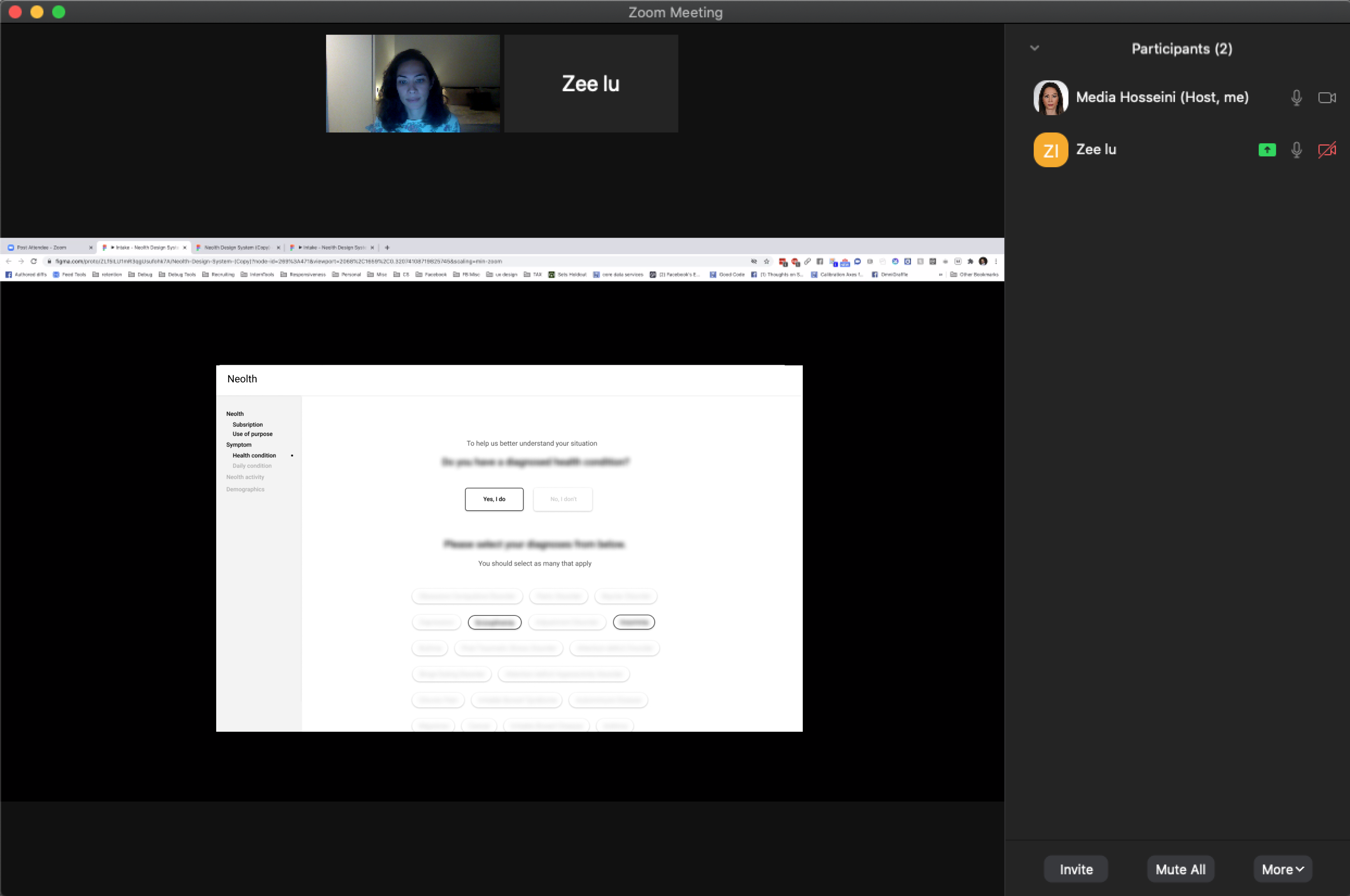
Usability Testing
Usability Testing
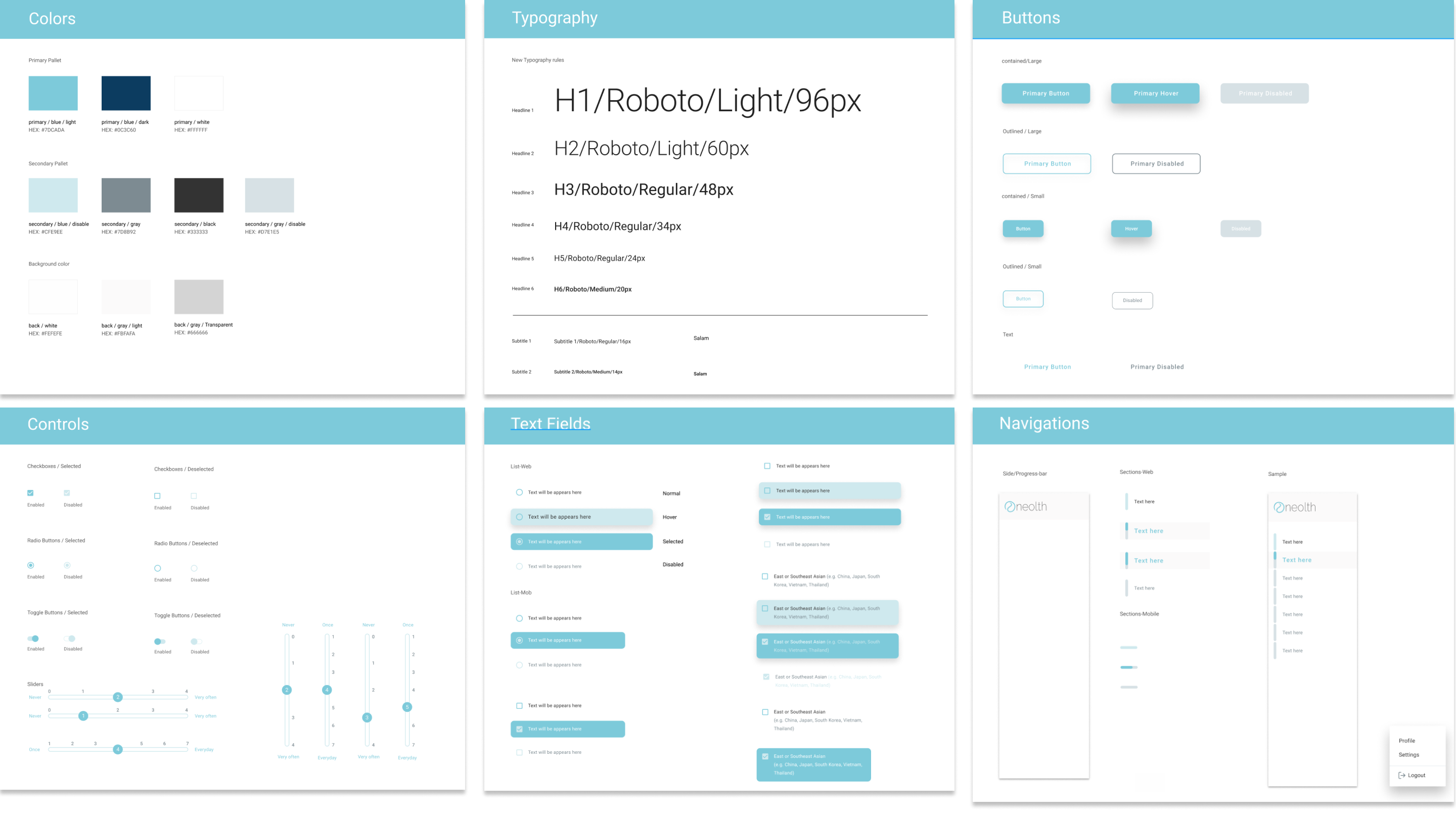
Before moving to the execution phase, I created a Design system to share consistent visual styles for both desktop and mobile screens to increase efficiency in the team workflow.

During this process, I also worked on Neolth’s brand identity and gave a fresh to their logo. The goal was to design a simple, calming, and gender neutral look that is consistent with the Neolth values.
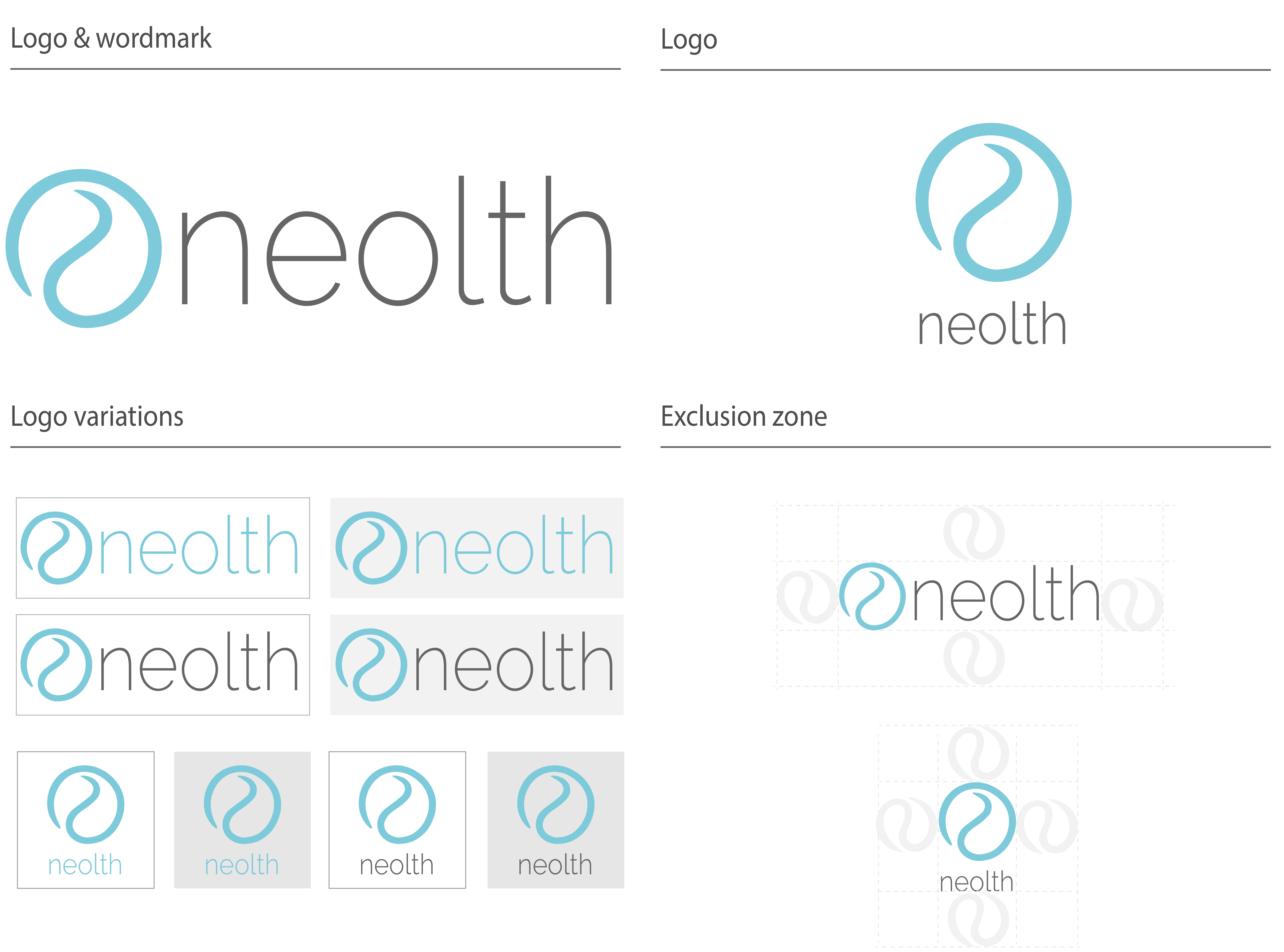
Brand guideline
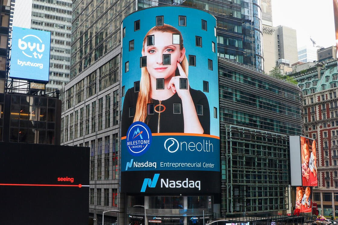
Neolth logo featured on Time Sq
After the usability tests, I gathered the insights and applied those into my designs, then I made sure all the designs were ready to hand-off to the engineers (Functional Requirements Document prepared by the Product Manager and me).
In the final design, each progress bar option has its own miniature progress bar. As each progress bar option has multiple questions, the main purpose of the color indicator is to show "where the user is".
Progress Bar Process
Q/A Format
Tag box
Self describe
When I worked on the design system I considered each component a responsive scale with a consistent design for mobile screens. However, some components need changes to be more accessible on mobile.
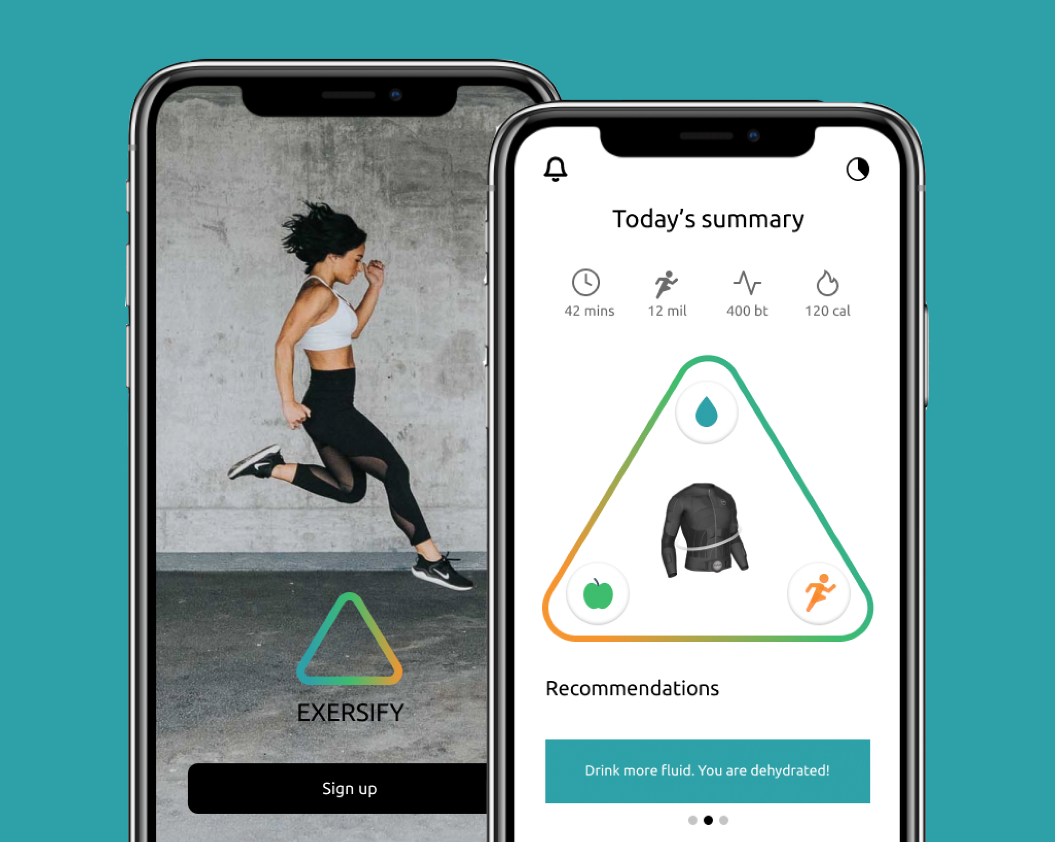
Performance Tracking App
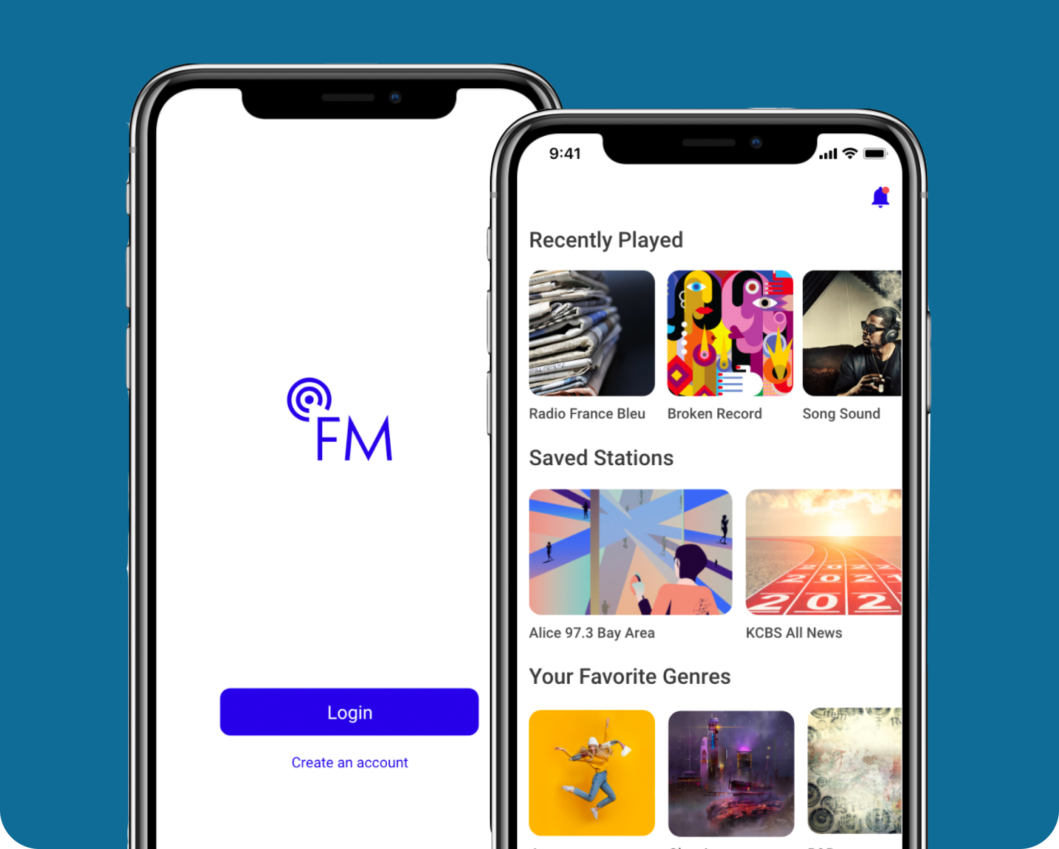
Live Radio App Redesign
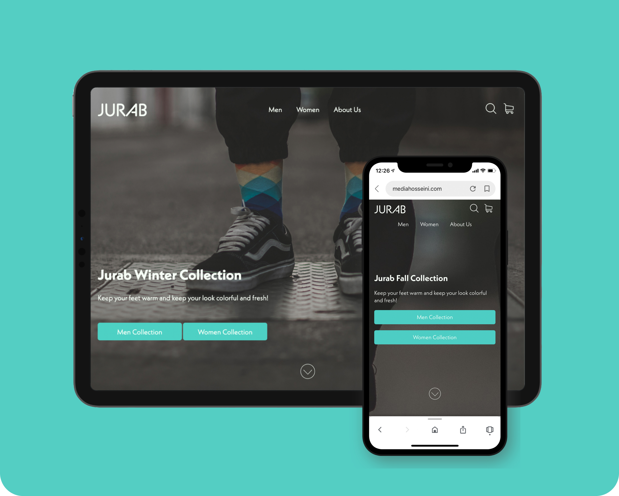
Ecommerce Website Development
Designed and Developed with 💗 by Medi Hosseini 2021
